Case Study:
Dashboard
Admiral is a SaaS Platform that provides digital publishers with tools to increase and maintain the revenue they earn through site traffic.
How can a redesigned user dashboard help “The Visitor Relationship Management Company” deepen their relationship with clients?
The Team
I worked with 4 UX designers to complete this redesign project. Our primary points of contact during the design process were the company’s co-founders and product manager, though I can also attribute our success to the open line of communication we were granted to their CEO along with representatives from their sales and customer support teams.
My team routinely conducted ideation and synthesis workshops across the design project’s timeline: most notably, a series of affinity diagram sessions after each round of user interviews, a series of 6-8-5 sessions to establish divergent concepts, and an empathy map workshop with the client’s founders during preliminary research.
Timeline and Tools
We completed this project in 4 weeks across 3 agile sprints and presented our progress to the client through meetings held at the end of each sprint. We utilized Figma and G Suite as our primary tools, and also used Zoom and Slack to communicate with our client and one another remotely.
My Role
Domain Research
I compiled and synthesized relevant, up-to-date information from reputable sources on all subjects within the project’s problem space that my team deemed necessary for the overall success of our design.User Interviews and Usability Testing
I moderated interviews and usability test sessions with our client’s users and recruited additional prospective users who aligned with the target audience. I also audited interviews and tests moderated by other members of my team to transcribe and take notes. Information Architecture
I applied our domain research and user inteview findings to reorganize the informational structure, key screens, and features of our client’s existing product in a manner that would better suit user needs and created a corresponding site map for the revised design.
UX Writing
I played a key role in the composition of long-form written reports including a domain research findings brief and a usability test report. I was also integral to shorter-form writing tasks such as the establishment of design principles. Visual Deliverables
I designed assorted graphics necessary to convey information including an empathy map, a site map, and slide decks for client check-in meetings. I also created a template and style guide for the project’s visual competitive analysis and annotated wireframes.Making Admiral’s Acquaintance
Managing Visitor Relationships
For this redesign project, I had the pleasure of working with Admiral, a SaaS company based in Florida. Admiral’s clients are digital publications like newspapers, blogs, and educational platforms: their software suite helps these publications recover and increase revenue earned from web traffic.
Admiral’s stated goal is to create a holistic relationship between publishers and their visitors through a vertical suite of products that allow clients to communicate with visitors and monitor visitor behavior through installation of a simple Javascript tag. Though Admiral’s services are most lucrative when used together, the majority of clients only use their adblock recovery service.
From Siloed to Centralized
Clients manage their Admiral account with a web-based dashboard that provides a control panel and a variety of relevant analytics for each service. Though frequent dashboard logins are not strictly necessary to recover traffic revenue, the availible resources can help users evaluate and improve their strategy to increase earnings.
Admiral’s motivation for a redesign was a low rate of user engagement with the dashboard relative to the size of their client base. Clients generally had a positive opinion the company’s services, but few regularly used the dashboard.
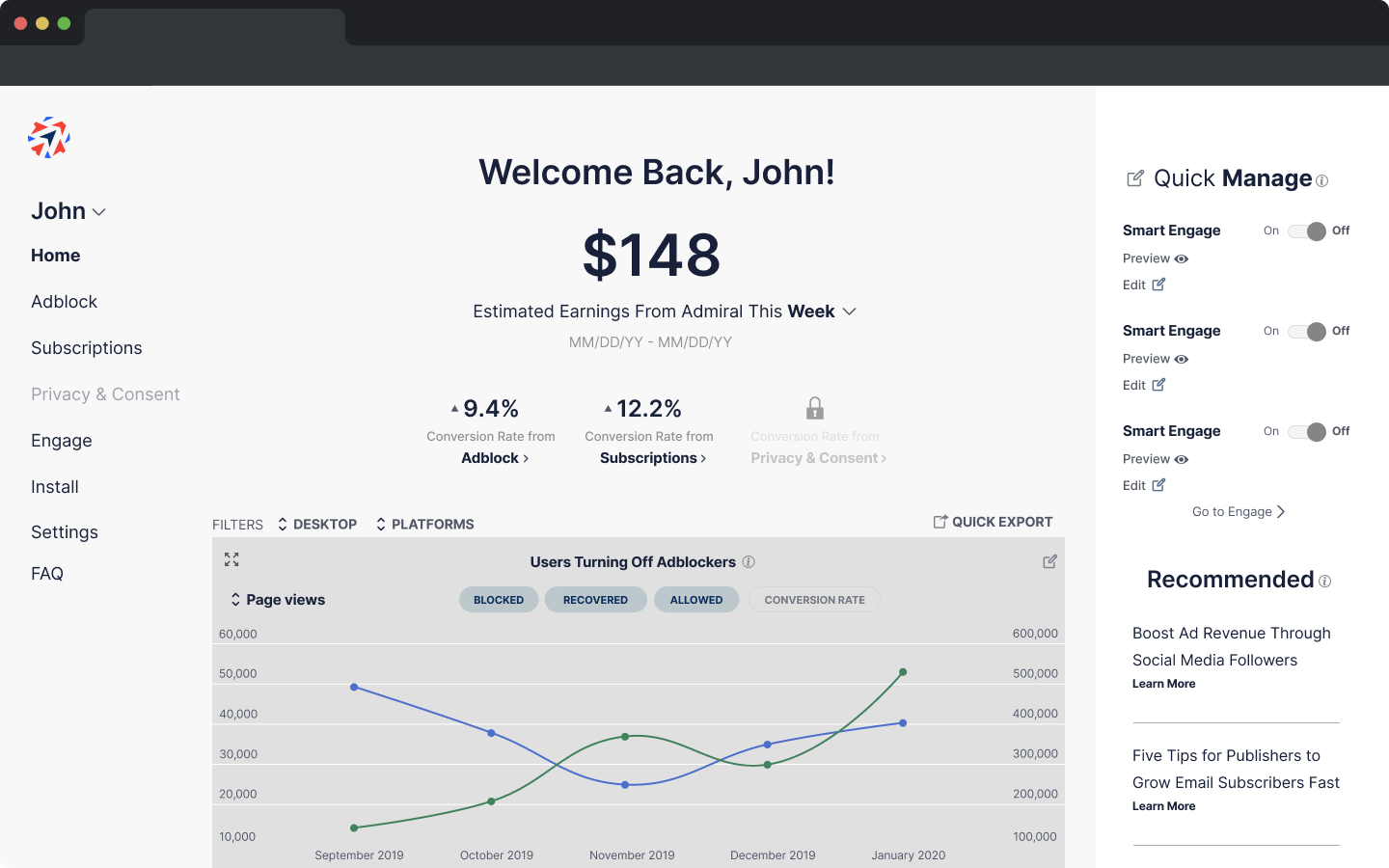
To address this, Admiral asked us to create a unified home dashboard featuring resources from each individual service’s dashboard page.
Admiral Dashboard
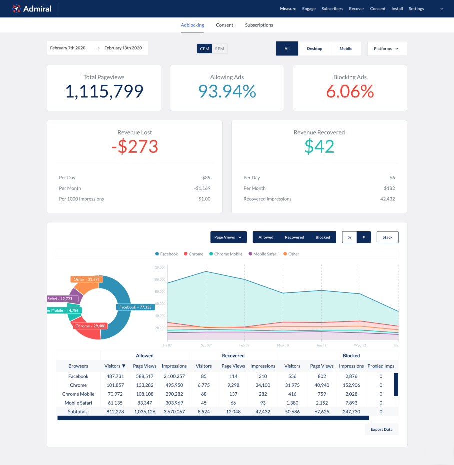
The dashboard page for each Admiral product is accesible via tabbed navigation.
With no centralized hub to act as a homepage, the user is greeted by the dashboard’s first tab, Adblock Recovery, by default upon login.


Admiral Onboarding
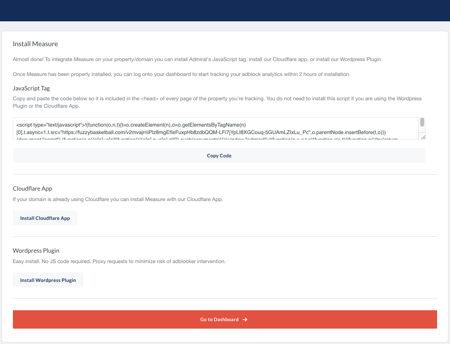
After registering an account, users are prompted to install the service’s javascript tag on their domain and then navigated directly to the dashboard.
Client Goals
Here’s what Admiral specifically wanted the design to address and provide:
- Upsell Opportunities - Encourage current clients who use just one service to consider upgrading and encourage potential clients to sign up for product updates, request a demo, or upgrade to a paid account
- User Engagement - Entice users to create a profile, access the dashboard website regularly, and recommend the service to others
- Onboarding - In addition to delivering a dashboard design, Admiral asked us to develop a comprehensive onboarding flow to guide users through the redesign and acquaint them with the new dashboard experience.
Gathering Research Insights
Understanding the Domain
In order to effectively fulfill Admiral’s goals, we conducted research on the industry of Visitor-Relationship Management to establish a thorough understanding of each service offered by Admiral:
Adblock Recovery
-
Adblock Recovery (or Adtech) detects software intended to block the advertisements that publishers rely on to generate revenue from web traffic.
- According to a 2019 Global Web Index survey, 45% of internet users globally have used an ad blocker in the past month.
Privacy and Consent
- Legally, digital publishers can only collect and sell visitor data if visitors provide consent according to standards set by GDPR and CCPA legislation.
- Publishers are seriously liable if they fail to adhere to these legal standards in addition to risking permanent damage to visitor trust and loyalty.
Subscription Services
- In lieu of adblock prevention, some publishers ask their visitors to commit to a subscription, either paid or in exchange for their email address.
- A 2017 NYT internal memo stated that newsletter subscribers read twice as many articles and are twice as likely to become paid subscribers.
Understanding the Competitors
Through our next step of research, we’d ensure that Admiral’s redesigned dashboard would not only drive user interest and engagement, but also align with standards and expectations set by their competitors.
We conducted a visual competitive analysis by annotating key screens from the dashboards of companies Admiral named as competitors, additional competitors we identified through domain research, and other widely-used digital resource management dashboards. Here’s what we learned:
Centralized Hubs are Industry Standard
Users who manage digital resources with a dashboard expect immediate access to primary tools located across the platform, confirming the client’s assumption that a unified dashboard will increase user satisfaction.Successful Dashboards are Customizable
The majority of dashboards annotated for this analysis offered users the opportunity to tailor dashboard experience to suit individual professional needs. By expanding the customization opportunities offered to Admiral’s users, there was an opportunity to increase dashboard engagement.Dashboards Should Provide Actionable Functions
The core appeal of a centralized dashboard hub is allowing users to take immediate action on high-priority tasks without navigating to a secondary page. The centralized Admiral dashboard will be most successful if it is not just a visual display of information, but a powerful tool in itself. Understanding the Client
In order to fulfill Admiral’s business goals, we wanted to broaden our understanding of the organization’s vision and brand. Admiral generously provided us access to three members of the company for subject matter expert and stakeholder interviews.
We spoke to representatives from Admiral’s sales team and customer support team for insight on the perspective of employees who interact with clients on a daily basis. We also had the opportunity to interview the CEO, which deepened our awareness of Admiral’s big picture and long-term goals.
Insight from Sales
The sales representative emphasized how multiple services can work together to serve a singular purpose. He felt it was important for the dashboard to communicate the potential each service has to monetize visitors using language easily digestible to clients.Insight from Customer Support
The customer suport representative shared that Admiral users often contact him directly with any issue or confusion they experience with the dashboard because the platform does not provide resources for user troubleshooting. He felt that ease of use should be a priority for the redesign.Insight from CEO
Admiral’s CEO expressed particular interest in representing Admiral as a horizontal suite of products that work best in conjunction with one another, with Average Revenue Per User as a unifying KPI metric. His priority for the new design was the potential for upsell opportunities.Understanding the Users
Obviously, we wouldn’t be able to fully address the needs of Admiral’s users unless we communicated with them directly. We conducted user interviews with 5 professionals who use Admiral for work in departments like ad sales, subscription coordination, and digital marketing at online publications.
We were particularly interested in how Admiral’s services impact the jobs of users on a daily basis, as well as their opinions on the current dashboard design. These were our biggest takeaways:
Clients Value Excellent Customer Support
When clients praised the company, they mostly referenced their experience with customer support, rather than their experience actually using Admiral products. This high degree of user support is a key part of Admiral’s appeal.The Dashboard is a Middle-Man
Many users pay a brief visit to the dashboard to isolate data relevant to their objectives and export it to another platform. Though this raw data is crucial to their professional responsibilities, they rely resrouces provided by other platforms to analyze and leverage this data.Lack of Feature and Product Visibility
Our interviews indicated that the current dashboard didn’t communicate the potential that Admiral services or any of their particular features have to increase revenue. Users understood the value of the service they used most often, but not how other products could further serve their interests.
Forging a Design Path
Visualizing the Problem
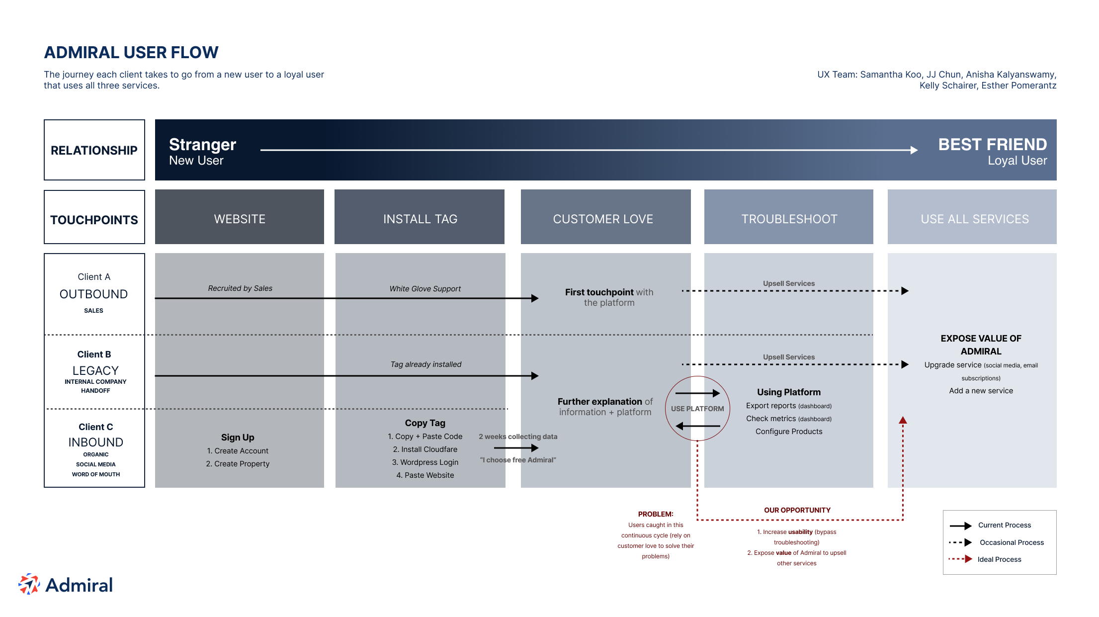
To apply and contextualize our research insights, we created a user flow diagram exploring the journey users would undergo as they gradually became more familiar with Admiral. For the purpose of this artifact, we defined new users as “Strangers” and clients using multiple Admiral services who would recommend the company to others as “Best Friends”.

Defining the Problem
This diagram visualized a critical insight from our research: Admiral user satisfaction was driven mostly through interactions with Customer Support, and rarely through positive experiences with the dashboard. Users of all types and touchpoints rely on customer service representatives to compensate for the dashboard’s usability issues.
This insight allowed us to articulate the problem our design would address:
Approaching the Solution
We now had a clear-cut design objective: by emulating the qualities that define positive experiences with Customer Love, we could help users feel comfortable navigating the dashboard without help, expand their understanding of both the services they already use and other services Admiral offers, and ultimately increase interest in upgrading to additional services within the product suite.
We established four design principles to inform the direction of our project: